HERO

This is a HERO component
It has one really large image, the optionally a smaller image in front.
This component can link off to a page, you can have text in the text area, or just provide a title.
You can add a title text optionally too
CAROUSEL
You can put anything in a carousel
Carousel anything
We have built the carousel control so you can add any control you see on this page
ALERT
ALERT
You can pick between 8 colours (see standard bootstrap colours), this one is called 'light'.
ACCORDION
This is an ACCORDION which you can click to see more information .
Here is some more information, you can put as much or as little in here as required.
CARD
CARD
This is a card, if you use size 4/12 you can get 3 CARDS nicely in a row. If you use size 3/12 you can get 4 CARDS nicely in a row.
Card
This is a 2nd CARD
CARD
Another CARD with very little text in it. This Theme is called 'Secondary'.
ICON CARD
IMAGE

IMAGE
Its on the left here. All you can really do with it is insert an image on its own and size it (any size from 1/12 to 12/12 or full screen).
HEADER & TEXT
HEADER
This is HEADER, a nice thing to put at the top of every page.
TEXT
This is TEXT just a big textbox you can put all your content in.
You can use large text.
Medium text.
Small text.
You can also add code and bold things and italic them and create links

CALL TO ACTION
This is useful if you want an image on the left or right some text and optionally a button that links to somewhere.
JAVASCRIPT
With JAVASCRIPT you can add custom javascript to your page. We use this sometimes for adding 3rd party tools like google search or animations to pages.
DISCUSSION
This allows your users to chat amongst themselves, only those who are logged in can see the discussion web part.
log in to see all comments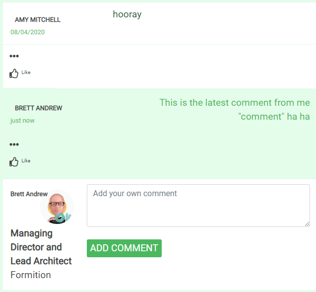
SHARE
These social media share buttons on the left is the SHARE control, it lets the user share the current page on a social medium.
SUBSCRIPTIONS
This dynamically shows all prices for each subscription / term that are published and active. Subscriptions are complicated, we can add more help for them specifically later. If you are ready to work on subscriptions let us know!
Standard
Free Trial
AU $0.00
per month (ex GST)
Business
Business Package
AU $1,199.00
per month (ex GST)
Business
Business Package + Apps
AU $1,399.00
per month (ex GST)
Corporate
Corporate Pricing
AU $2,499.00
per month (ex GST)
PAGELIST
Above is called PAGELIST, it matches a URL pattern and displays the pages all and any pages that matches meta information (title, discription and teaser image in a list). You can resize the boxes that are displayed too.
PAGENEXTPREVIOUS (not displayed) is similar but only shows the next page in order (it actually does not show the previous page in order yet, but we plan to make it do so.

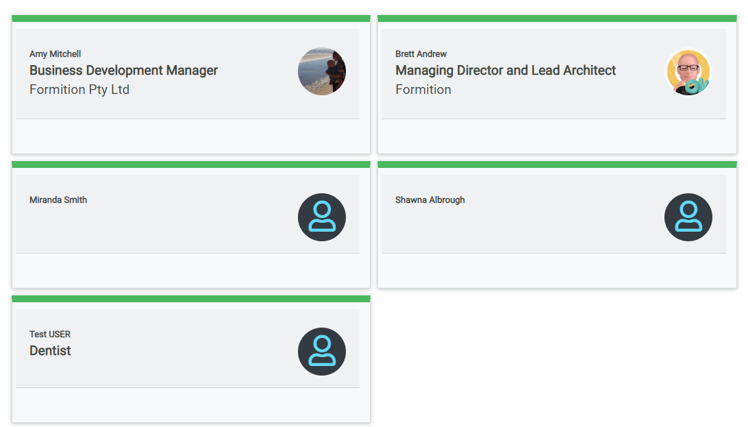
USER DIRECTORY
Put this on a page and make it accessible to various members so they can have social interations with each other.
VIDEO
You can upload video or use a YouTube link or your own custom embed code (e.g. Vimeo etc)
this tiny tiny text is the control
DISCLAIMER
perfect for when you want to ensure your legal concerns are addressed.
CONTACT US
The CONTACT US form is pretty self explanatory
Contact us
Bootstrap padding and offset
You can also add custom Class to each component. This allows you to add bootstrap classes such as these:
ml-auto
margin left auto
mr-auto
margin right auto use this with the above one to centre a box in the screen
offset-md-2
this will offset the container so you don’t have to put a filler box before it, as we discussed. This one is a size 2 – replace 2 with any value between 1 and 11.
(note: you can use more than one custom class on the component).
Animations
Similar to Bootstrap classes, try these animation classes.
animate__animated animate__shakeY
The component will shake
animate__animated animate__fadeInDownBig
The component will make a grand entrance
animate__animated animate__bounce animate__delay-2s
The component will bounce, but will wait for 2 seconds first